eCommerce blocks - product list & grid
Collection of practical examples of product lists and product grids. These kinds of sections are necessary when creating listing pages and shop filters. You will find here solutions for all the possible use cases that can occur during creating eCommerce projects.
Basic example
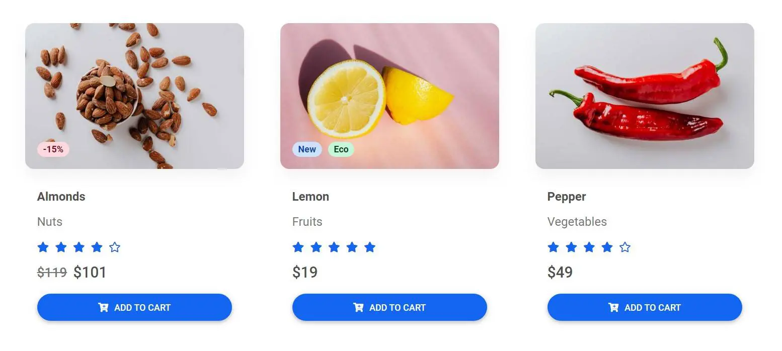
The basic example of the product list, containing elements like badges, ratings, prices, titles, and subtitles.
Note: If you are using images with a colorful background you can also add
shadows to them. In this example, we are adding a very subtle shadow by using
MDB shadow utility class
.shadow-4-soft.
Screenshot
Get the code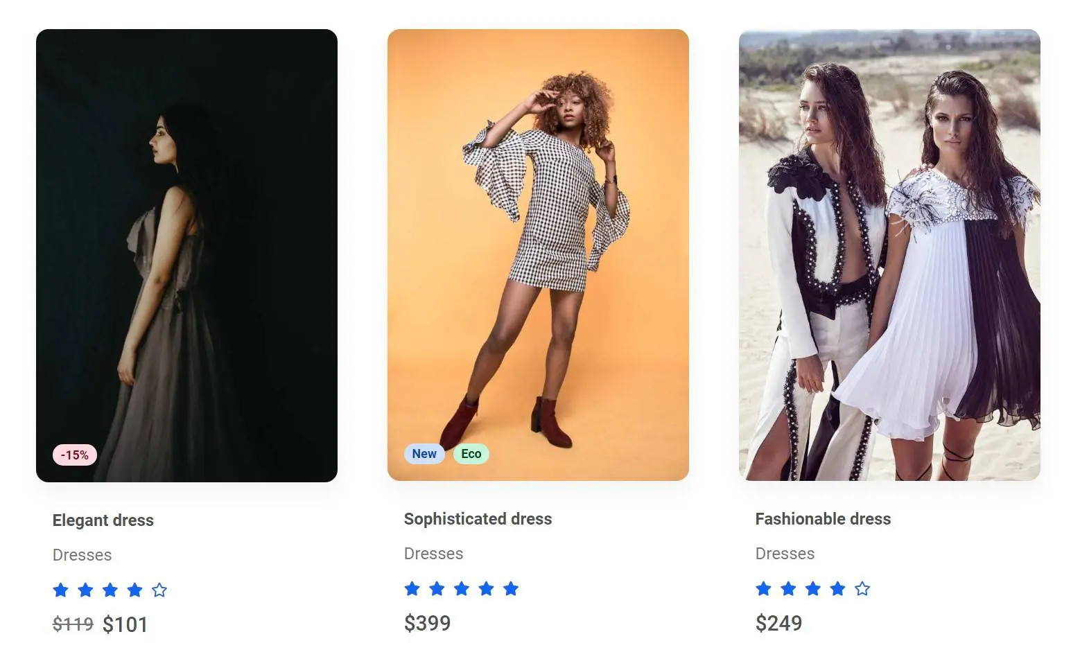
Strong shadows
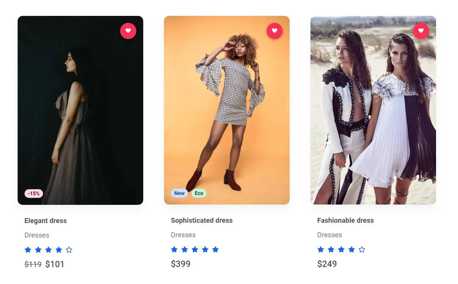
For dark images, it's a good idea to use strong shadows. Otherwise, the shadows may be not visible due to weak contrast.
In this example, we are using
strong shadows
via .shadow-4-strong class.
Screenshot
Get the code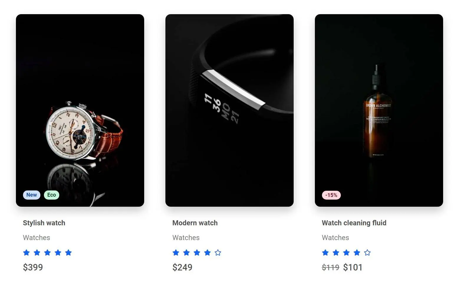
Transparent background
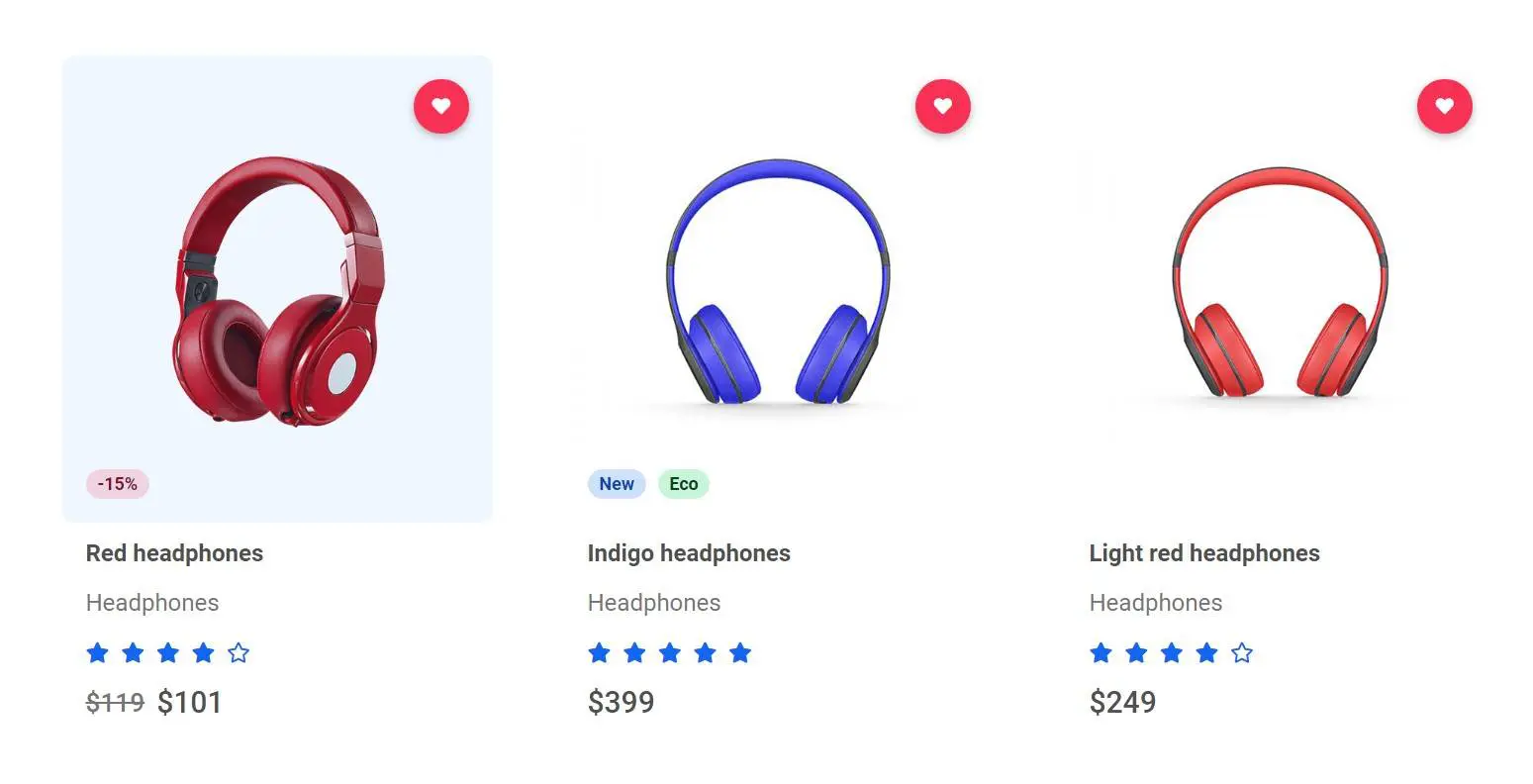
If you use product pictures with a transparent or white background you should avoid adding shadows. The contrast will be very strong and the entire composition can seem heavy.
Instead, you can add a subtle, yet clearly visible, hover effect like this nice, blue square in the example below.
Screenshot
Get the code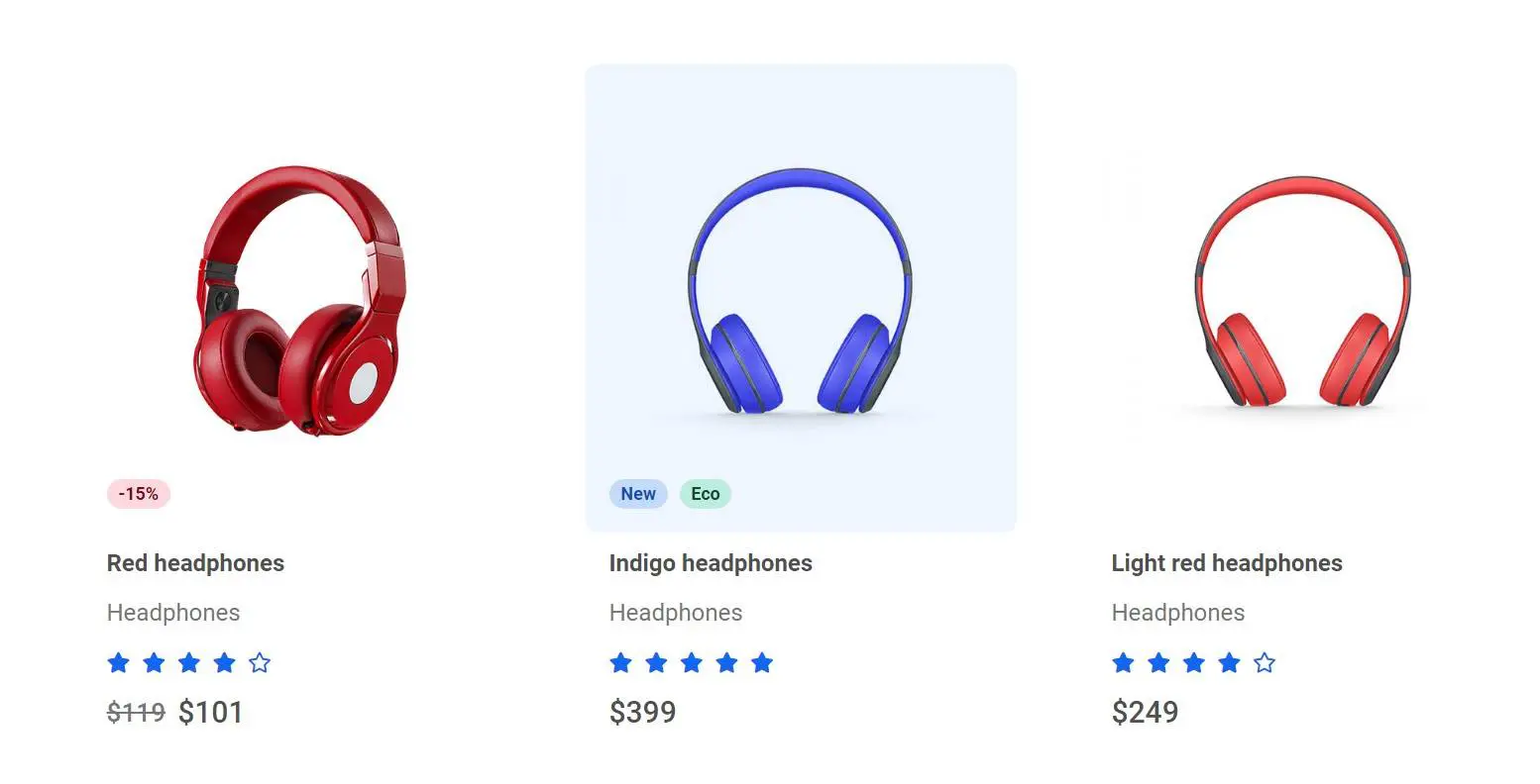
Background image
Ale the previous examples use img tags for displaying product pictures. It's the
most popular solution and thanks to Bootstrap grid and utility classes like
.w-100 or .img-fluid the entire composition is responsive and well
looking on all the screen sizes.
However, this forces you to prepare your images before using them. You need to crop and scale them to the same ratio and height, otherwise, they will be displayed unevenly.
There is also an alternative way - creating wrappers with predefined height and setting images as a background. Thanks to this you don't need to worry about the exact size and ratio of your images, because thanks to the wrapper they will be aways displayed evenly.
Although very convenient, it can also backfire. You should define different heights for the wrappers on different screens, otherwise, you risk your images will be unexpectedly cropped. Use this solution carefully.
Screenshot
Get the code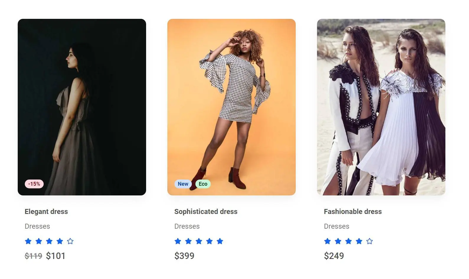
Cards
If you want to emphasize the contrast between the products you can stylize them as cards.
In the example below, we are using shadow utilities and some extra padding to create cards.
Screenshot
Get the code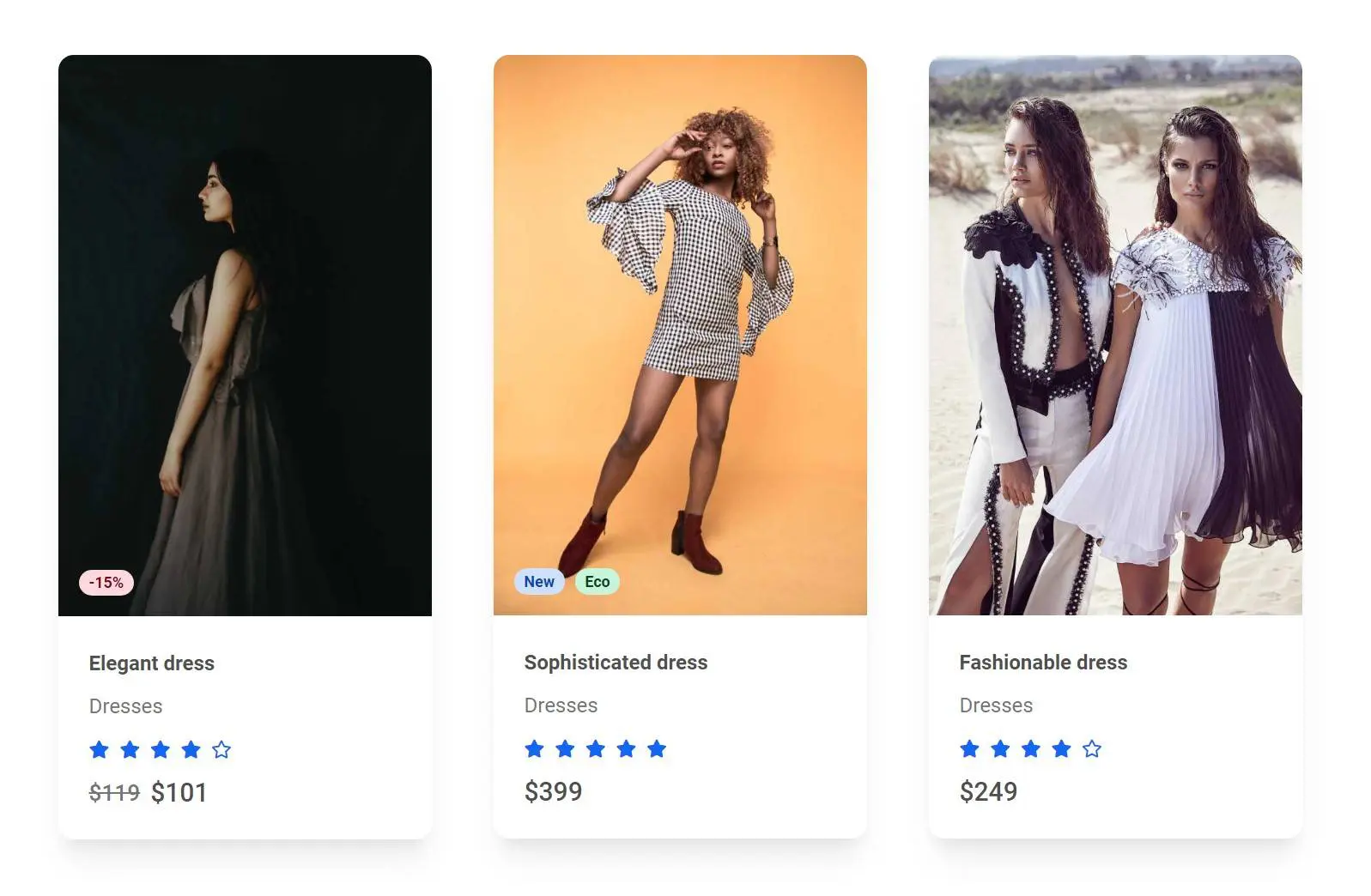
Border radius modifications
You can easily modify border-radius if you want to increase or decrease its size.
Angular corners can give the impression of being "more serious", which can give a better reception in the case of luxury items, for example.
Screenshot
Get the code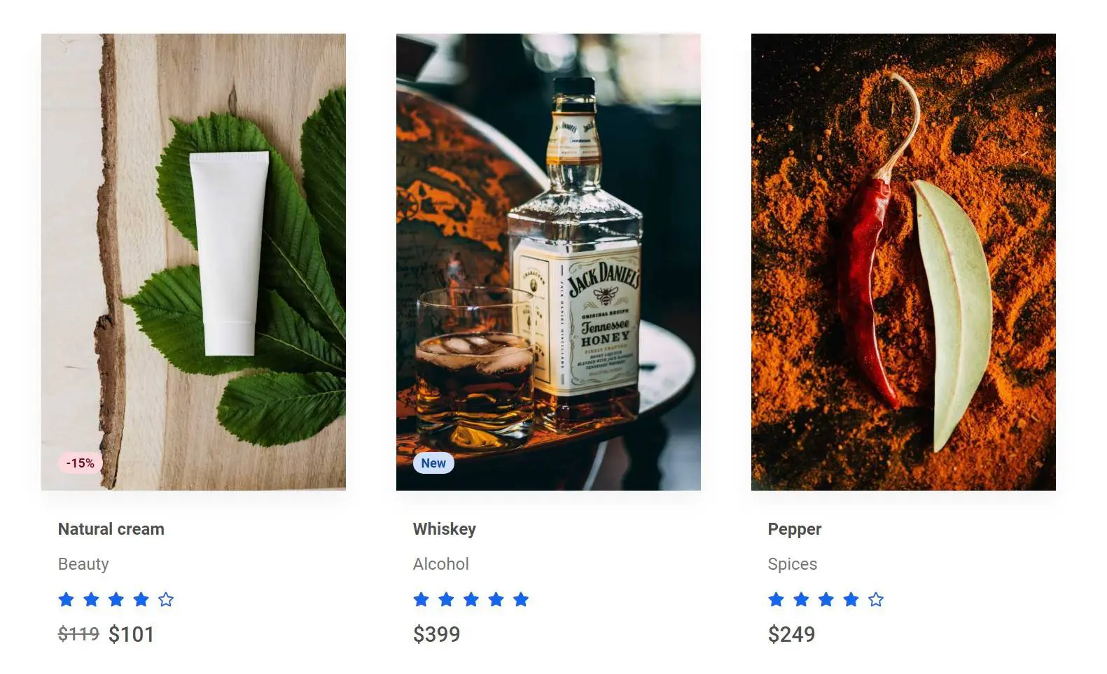
4 items
If you have more space, instead of 3 you can use 4 items.
Screenshot
Get the code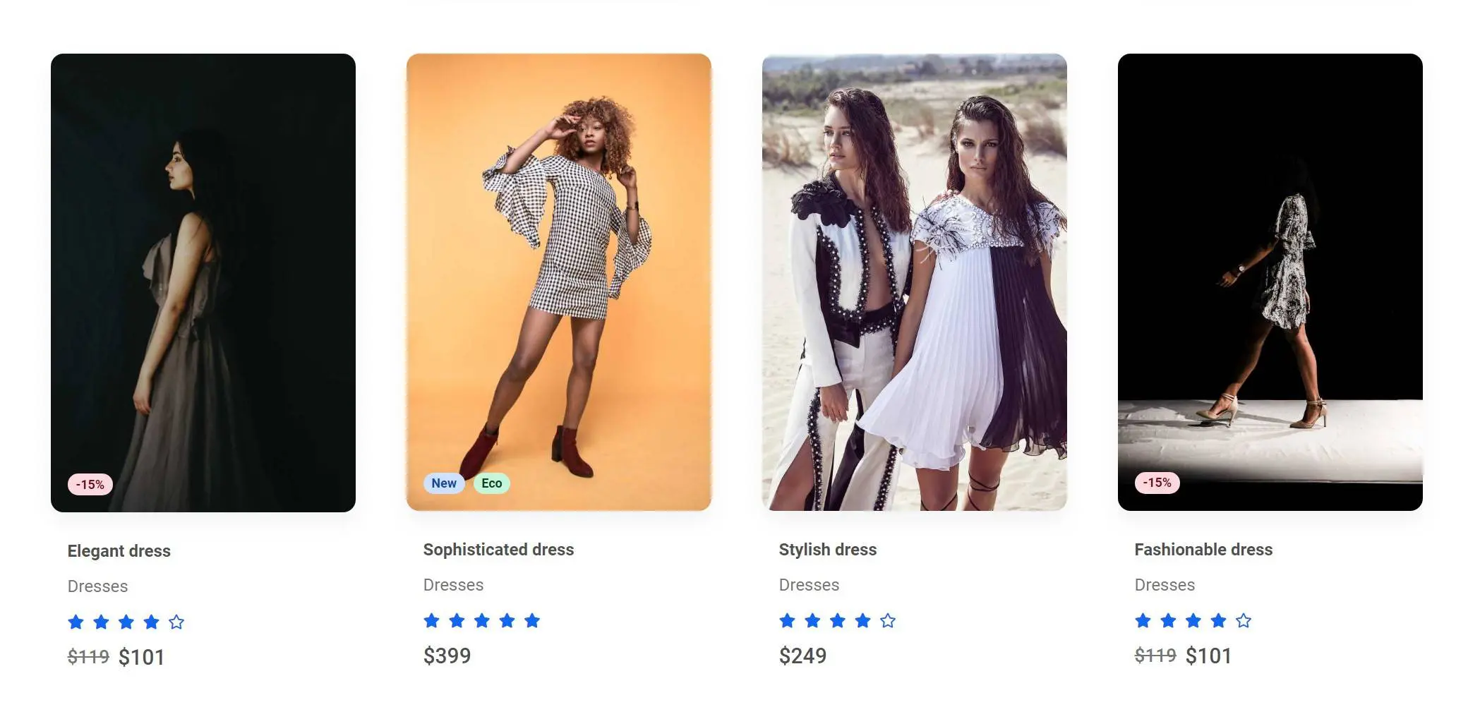
Zoom on hover
Screenshot
Get the code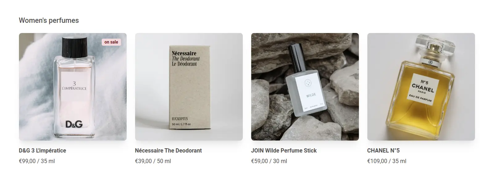
Outline "Add to bag" buttons
Screenshot
Get the code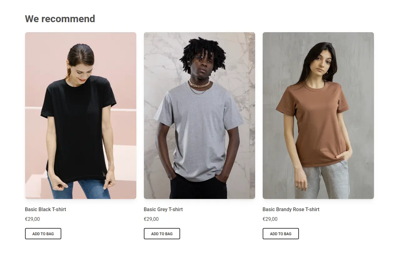
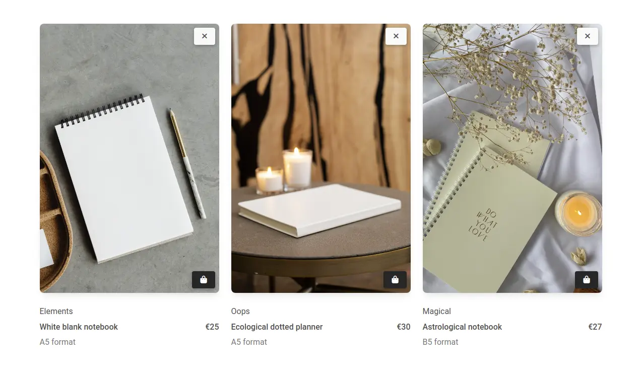
Three columns with close button
Screenshot
Get the code